|
Topic: |
Automotive
Photography 3: Concepts
|
|
Author/Copyright:
|
John Jovic
|
A good automotive image starts
well before any cameras or lenses see the light of day. If the aim is to
create an engaging image, one that attracts the viewers attention for
more than a fraction of a second, or just one that is aesthetically
pleasing, then it's probably more important to have a suitable idea or
concept than it is to simply get all
the technical photographic details right. A good idea executed poorly
could potentially make for a more interesting or memorable image than a
bad idea executed meticulously.
Most styles or types of photography are all about the subject matter
itself, portraits, landscapes, still lifes etc. The subject itself, and
it's nuances, is often enough because it is the entire content of the
image. Expressions and poses in portraits,
lighting in still lifes or landscapes, context or juxtaposition can all be
used in a myriad of ways to highlight the subject or to express meaning. But with automotive
photography the subject is largely the same, it's just another car, but
a different style, shape, colour. However, car's certainly do have their
own character or style, even personality, and they certainly do vary a
lot. Vintage, Hot Rods, Customs, Exotics, Muscle Cars, Collectibles and
race cars are just a few examples of types or cars with distinct
characters. Each of these has it's own style
or feel that needs to be addressed in any image otherwise the image may
not work or even clash with the viewers perception of the cars
personality. If you can portray the car faithfully, bring an idea to life
or maybe tell a
story then you will have done well. If you
come up with a truly original idea then you have done something special.
Clichés and crowd pleasers
The thing about clichés is that they are understood by the vast
majority and in many ways are just plain old 'crowd pleasers'. Rig
shots, panning and tracking shots come to mind as they really can be a
bit boring, mainly due to compositional limitations, but people like to
see them. Being too different or experimental might be very satisfying
to yourself but will it please the client? Some times the simple
clichéd image, like a sunset shot in the country, is the one
that the client wants or that suits the look of the car.
 |
|
 |
|
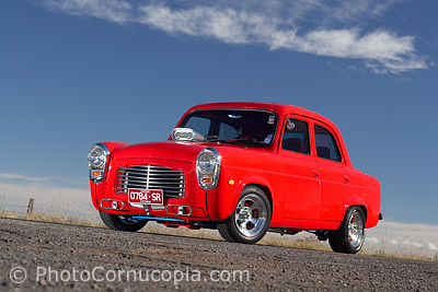
This image is arguably quite plain, having a
simple country feel, but it
is definitely very effective at making the car the star of the show
thanks to contrasting colours and very simple and clean fore ground
and background. |
|
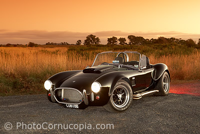
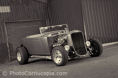
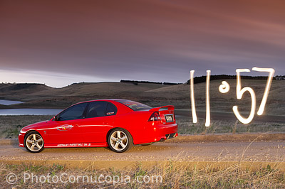
Here's a simple and
clichéd sunset shot in the country. It's a simple image that suits
the style of the car and works well.
|
 |
|
 |
|
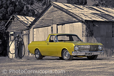
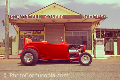
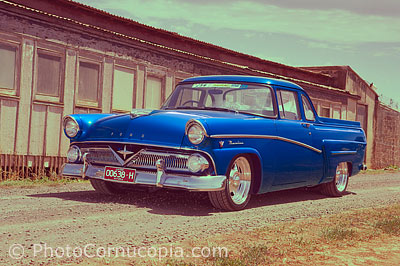
Another cliché, the retro ute at an old servo or
petrol station. |
|
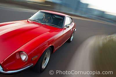
Rig shots, panning and
tracking shots are commonly used to portray speed, action,
performance and are great at giving the viewer a sense of being
there behind the wheel.
|
 |
|
 |
|
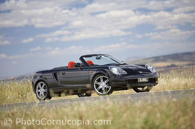
Another common theme is the 'country-drive',
particularly in 'new car' magazines. It's simple and everyone can
relate to it. Here the age or style of the car doesn't clash with
the location itself which doesn't really imply very much of a
meaning of it's own. |
|
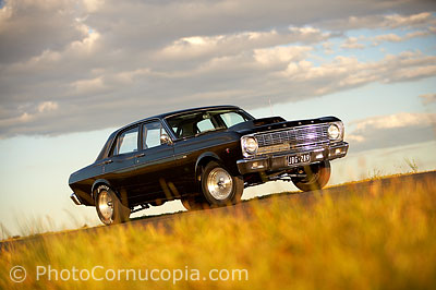
The
location itself doesn't always impress any particular meaning to the
image. As an example, this is almost the same image as the one on
the left. Although the 2 cars are very different, in age and
function, both styles of car work well quite well in this setting.
The same would apply to many other locations where the viewer can
apply their own understanding of the context, rather than the
location apply any particular meaning to the image. That's the
advantage of simple locations such as this.
|
All of the above images are
fairly simple images that work quite well and suite the style and feel
of the car. One of the most important aspects of finding an idea that
works is to find one that the viewer or client will actually 'get'. This
is where we can often go wrong as photographers because we often shoot
to please ourselves, which is fine if that's the goal, but some times
it's at the expense of an image that really works.
Always have a plan
Having a great idea is one
thing but making it a reality is another. For example, shooting a Hot
Rod in front of a 50's Diner is a common and popular theme but finding
such a Diner is simply impossible in many parts of the world. In fact,
even if you do have access to one you will need to negotiate it's use
with the owners and possibly have to pay for it's use (consider also
that it would need to be free of other cars that would potentially ruin
the shoot). This is fine if the image is being shot for a commercial
use, where it's normal to have to pay for the use of a location, but
it's not always possible in normal circumstances. Many times a good idea
just costs too much. The moral is not to 'aim low' but to be realistic
and, more importantly, to be flexible and always looking for options.
Always have a plan, but try to have a 'plan B' as well. If you go into a
shoot with an idea in mind then you're way ahead already.
Some times a car is quite
unique and may call for an unusual concept or theme. The result won't
always work but it can be these odd cases that give you the most
interesting images as long as you are willing to get out there,
experiment and try new things, locations, lighting compositions etc.
It's true that you don't
always need a concept or great idea but the viewer shouldn't be left
confused either, wondering what just happened. Mismatched styles of car and location lead to confusion.
For example, what is being suggested when an exotic car like a
Lamborghini or Ferrari is photographed in an old rail yard? Is there a
corpse in the boot about to be dumped, was the car stolen and dumped
there, why would it be there at all? The same kind of mismatch can also
work the opposite way where an old car is photographed in a modern
location. The images
might still be aesthetically appealing but the clash might also be too
much of a distraction in itself.
 |
|
 |
|
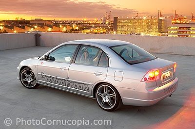
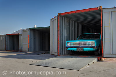
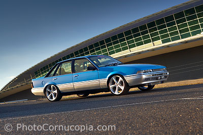
This modern location clashes with this car from
the '80's. The car is fine. The location is fine. They just don't
look good together. However a modern
car would look great here. |
|
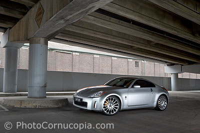
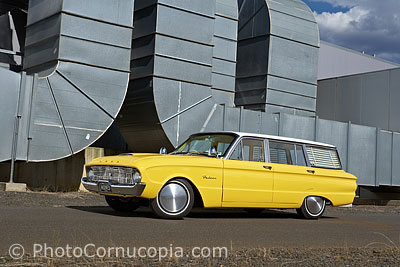
This is another
example of an interesting location but one which doesn't connect in
any way with the style or character of the car. The image is
difficult to relate to and understand. There is no underlying
concept or idea behind the shoot, just an interesting location.
|
