|
Topic: |
Automotive
Photography 4: Composition
|
|
Author/Copyright:
|
John Jovic
|
Composition is about the
choices you make when you compose the elements of the image within the
frame. These elements might be colours, lines, shapes, light and dark,
or just empty space itself. It's about creating an aesthetically pleasing image, whatever
that is to you because it's not always the same thing for everyone. You
can choose to place the car in the centre of the frame or a corner, it
can dominate the frame or take up just a small portion, you might shoot
up from ground level or down from a ladder, with a wide angle lens and
close to the car or a long telephoto and a distance away. All these
choices, and more, alter the image and although there isn't always a
correct way, because it's subjective, the choices you make will always
dictate the end result.
 |
|

|
|
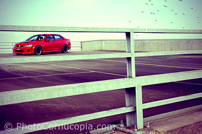
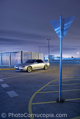
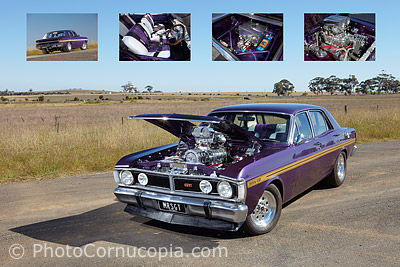
Here's an example of an odd composition. It may or
may not work but it's an example of the choices one can make where
in this case the car isn't even in the foreground of the image. |
|
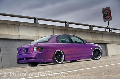
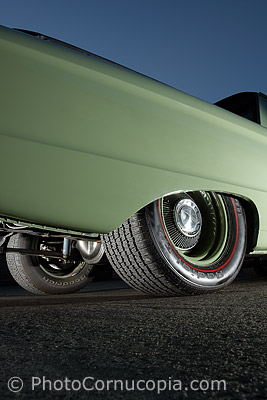
Shot from low, from
the rear, with the car angled slightly up. These are all choices,
consciously made, which are intended to add to the impact of the
image. Even the broken glass in the foreground was intentionally
left there.
|
 |
|
 |
|
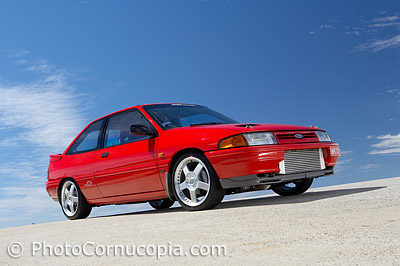
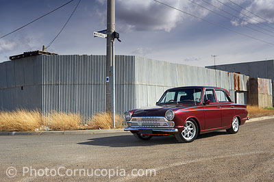
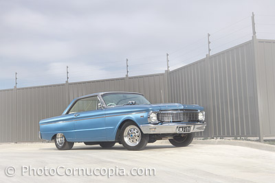
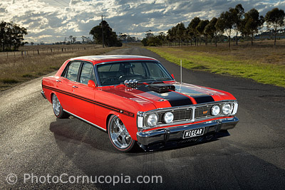
This image illustrates the difficulty in finding a
balance between and interesting image and one that makes the car
dominant and stand out. This image is arguably quite boring but it
is definitely very effective at making the car the star of the show
thanks to contrasting colours and very simple and clean fore ground
and background. |
|
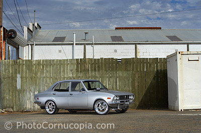
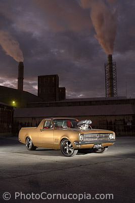
And this image is
probably the exact opposite of the red car to the left. This image
is full of clutter and potentially distracting objects but it's been
composed in such a way that the car is still dominant and clearly
the centre of attention. Lighting and background colour choices are
important in making the car stand out from it's surroundings.
|
Composition can be learnt in
a number of ways. There are even 'rules' that you can learn and apply. You can certainly read about it, and practice, but you
can also study the work of other photographers and of the great painters
(and other artists), past and present, and try
to understand why they have done as they have and learn from them.
Jeffery Smart is an Australian painter whose work is largely composition
based and is certainly worth studying.
Composition is often dictated
by the end use for the image. So, if the image is intended for the front
cover of a magazine, for example, then it might be shot in a vertical
format with adequate space for the magazines Banner above and text
below. Magazine, advertising or commercial layouts often call for text
to be laid out over the image so an image might be shot a little wide or
'loose' to allow for that. Alternatively you might shoot fairly tight,
so as to show the car closer and in greater detail, but this also has
the effect of minimising the background in the image so it can have the
effect of just shooting the car against a blank wall, simply because you
can't see much past the car. It's worth remembering that you can always
crop into an image but you can't make it wider in post.
 |
|

|
|
This is not a typical composition but arguably
works well. The elements of the image have been arranged so as not
to dominate the image or distract from the car itself. This image
was shot for a magazine layout so extra room was allowed, below, for
text. |
|
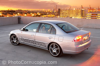
This is a fairly tight
crop, maybe too tight, be fairly typical of the composition used by
many magazines. Notice also the parking bays marked on the ground
around the car. These are best avoided, if possible, or cloned out
in post processing. The image would be far cleaner without them.
|
 |
|
 |
|
An example of composing the image with the an end
use in mind, specifically a poster. |
|
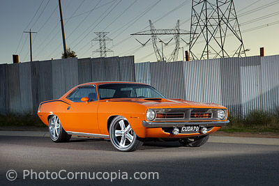
As cluttered and
potentially distracting as this background is, the car was carefully
placed in the frame. This image would be ruined if the power lines
where poking out of the top of the car which would result from
shooting from a much lower angle.
|
Another factor is lens
choice, or more specifically the perspective you choose which is
determined by your distance from the car, not the lens itself. For
example, if you want to fill the frame with the car but want to use a
wide angle lens then you will need to be fairly close to the car. This
will distort the shape of the car, making the part of the car closest to
you larger than the the part of the car furthest from you. Conversely,
if you used a telephoto lens and still filled the frame with the car in
exactly the same way as with the wide angle lens then all the parts of
the car, furthest and closest to you, are closer to being the same
distance in relative terms so they are distorted much less. If anything,
long telephoto lenses have a flattening effect. All in all, it's not the
lens that causes these differences in the appearance of the car, it is
ONLY your distance from the car. If you shot a car from the same
distance but with a wide angle and telephoto lens, and then cropped the
wide angle image to match the telephoto image, you would find that they
are the same image. Rather than choosing a lens, choose a perspective
and then choose the lens to suit.
 |
|
 |
|
The flattened perspective in this image is due to
the distance from the car to the camera and therefore the use of a
relatively long lens. |
|
Here a 50mm lens is
used to get a fairly natural perspective of the car, although the
front of the car is definitely distorted it's not objectionable. A
high viewpoint also allows more of the background to be visible and
give the image greater context.
|
A side effect of lens choice
is the way the background of the image is affected. Using a telephoto
lens allows you to 'zoom' into a small part of the background or
location and exclude all kinds of unwanted clutter. This can also help
to isolate the car from the background itself depending on the amount of
depth of field used and the distance between the background and the car.
On the other hand a wider lens will tend to include more of the
background or location in the image. This can be useful to tell more of
a story about the location and to give context to the image.
 |
|
 |
|
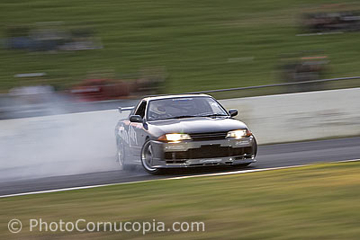
The way an image is composed, or cropped, can have
a significant effect. In this image ample room is left for the car
to move into. |
|
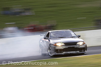
In this image, which
is just a cropped version of the previous image, no room is left for
the car to move into creating a sense of drama of it's own. This is
arguably a more effective composition, if a little less orthodox. |
